Tuesday, May 18, 2010

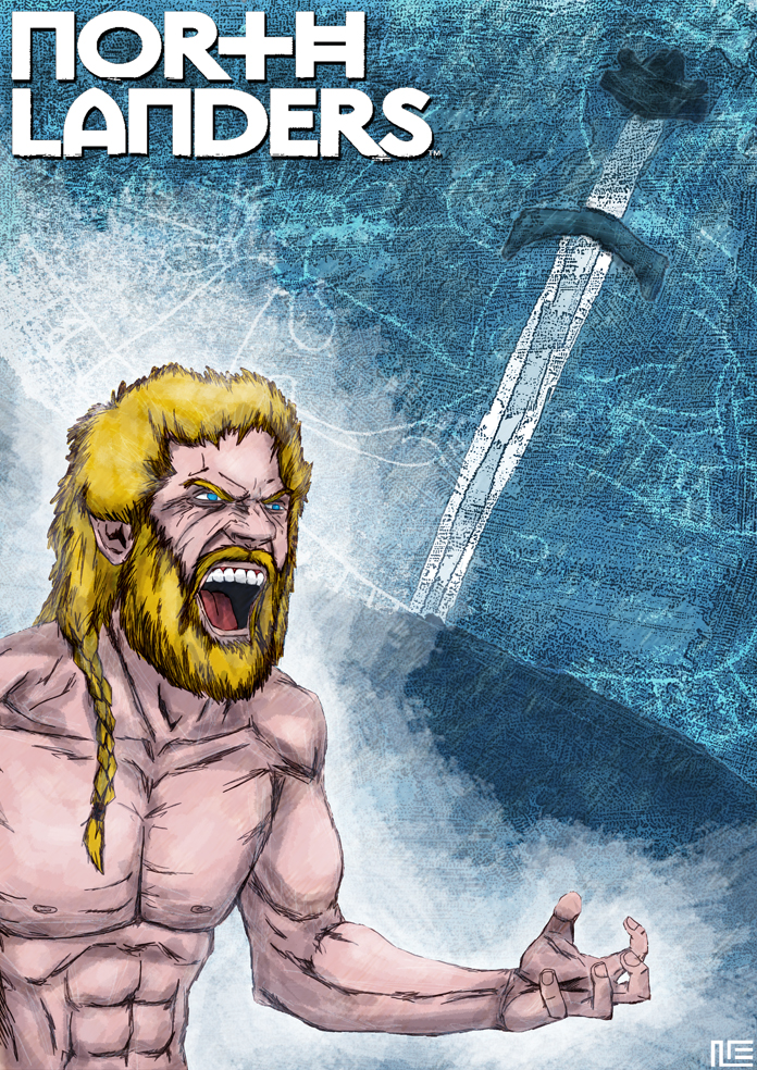
NORTHLANDERS


This illustration combines digital drawing and a mix of digital and watercolor painting for the background. I wanted to oppose the warm colors of the character (his skin, his hair) with a cold palette of blues in the background, symbolizing the wild temper of Norse warriors against the weather of those regions.
Brian Wood is a great writer, and that, combined with the fact that I love history books/comics, made me want to read NORTHLANDERS since the moment I knew this comic existed. I also love the idea that every story-arc is a different tale with different characters, moving from a time and place to another.
[Northlanders created by Brian Wood]

Tuesday, March 16, 2010

LINCOLN RED CROW


This illustration is a mix of hand-drawing and photoshop. I used pencil to render Red Crow's wrinkles to make them look more natural. One of my main problems was where to put the name of the character.
Lincoln Red Crow in one of the most complex and interesting characters in SCALPED, and I can easily say he has become my favorite one of the book.
[Lincoln Red Crow created by Jason Aaron and R.M. Guéra]

Friday, March 5, 2010

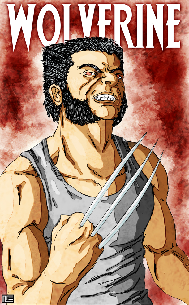
WOLVERINE


This is an all-digital illustration. My first idea was to keep Wolverine's drawing in black and white with a red background, but the character looked too lifeless to me and I ended up coloring it too. I also wanted to give the line of the drawing a rough, wild feeling, which is a style that I keep loving more and more.
Some months ago I showed this Wolverine illustration to a comic editor, who didn't quite like it because found it not to be very Wolverine-ish (oddly enough, it wasn't a Marvel editor). Sometimes I feel kind of tired of all those badass pin-ups where we always see him furious, and that's why I wanted to draw a hieratical Logan. Anyway, I guess that editor was right and that illustration (which I just realized I drew about a year ago) isn't the typical Wolverine we are all used to, so I decided to try a similar pin-up portraying an angrier Logan this time.
The model for this illustration was pal Juan Carlos Fernández.
[Wolverine is a property of Marvel Comics]

Thursday, January 28, 2010

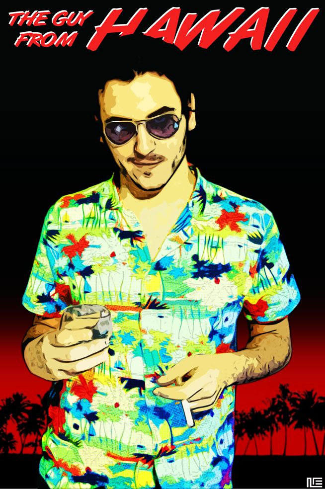
THE GUY FROM HAWAII


I mixed photography and digital drawing here. My challenge was to give the character a colorful touch (that the hawaiian shirt gave me) while keeping a noir feeling on the whole cover, and that's why I only used two colors (black a read are very noir colors for me) on the backgound.
For a long time now I've had in my mind that character who I used to call The Guy From Hawaii. Some days ago I filmed a short with actor Santi Gimeno-Bayón. Looking at how he was dressed, I realized that I had created a character for that short that was unintentionally inspired in The Guy From Hawaii character, so I decided to use him as the model for this illustration.

Saturday, January 16, 2010

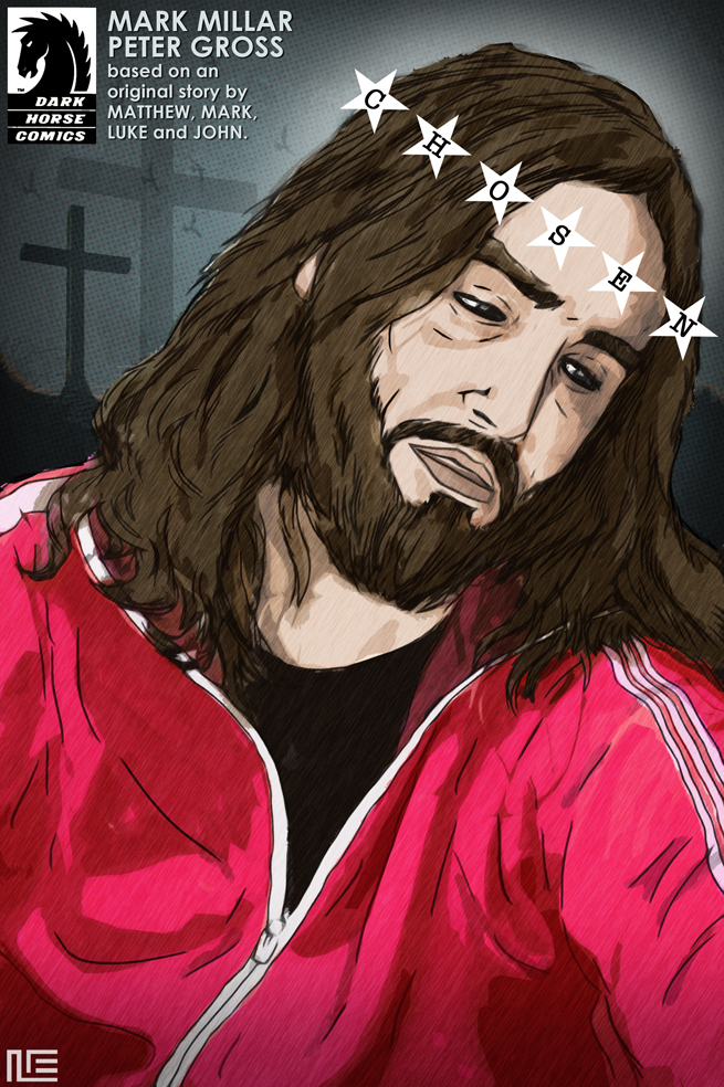
CHOSEN


This is an all-digital illustration. I love the combination of Jesus' tilted head and sad expression (a typical Catholic depiction of the character) with the pink-red tracksuit. I wanted to incorporate the book's title in the whole image, and decided to use it as a metaphor for Jesus' crown of thorns.
I guess nobody can deny Jesus Christ is one of the most iconic figures in Western popular culture. That's why I find it kind of surprising that there are not many comics out there about the character.
I used a picture of pal Javi Gimeno as the basis for this illustration.
[Chosen created by Mark Millar and Peter Gross. The Dark Horse logo is a property of Dark Horse Comics]

Wednesday, December 30, 2009

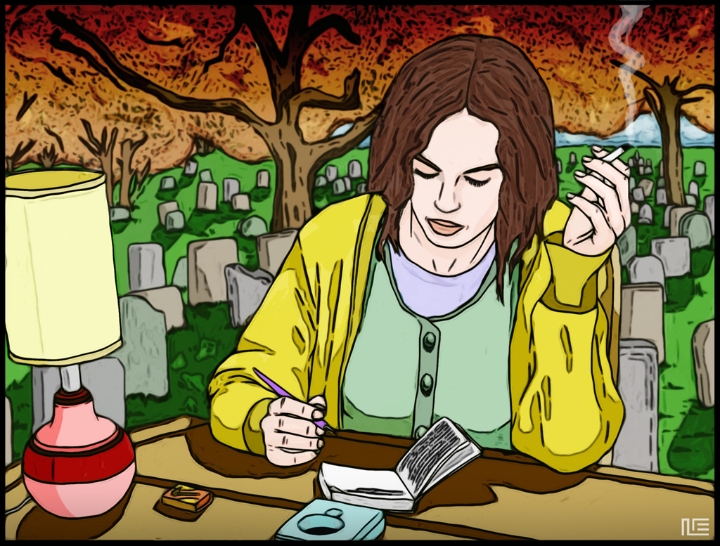
THE WRITER


I had that idea for a very sad, melancholic illustration about a writer living in a house that was actually a cemetary. In my mind it was a dark, sinister, somehow Mignola-ish illustration that I really wanted to do... but I postponed it for a while, and when I took it up again some weeks later I found that I had changed my mine. Now I wanted to try how the same idea would look like if rendered with a bright and colorful style. I also decided to use flat colors to make it even naïver than the original idea. The result is, of course, something totally different from what it should have been, but I enjoyed a lot doing it.
The model for the writer was actress Mónica López, after some pictures of her I took during the filming of a music video she starred.

Tuesday, October 27, 2009

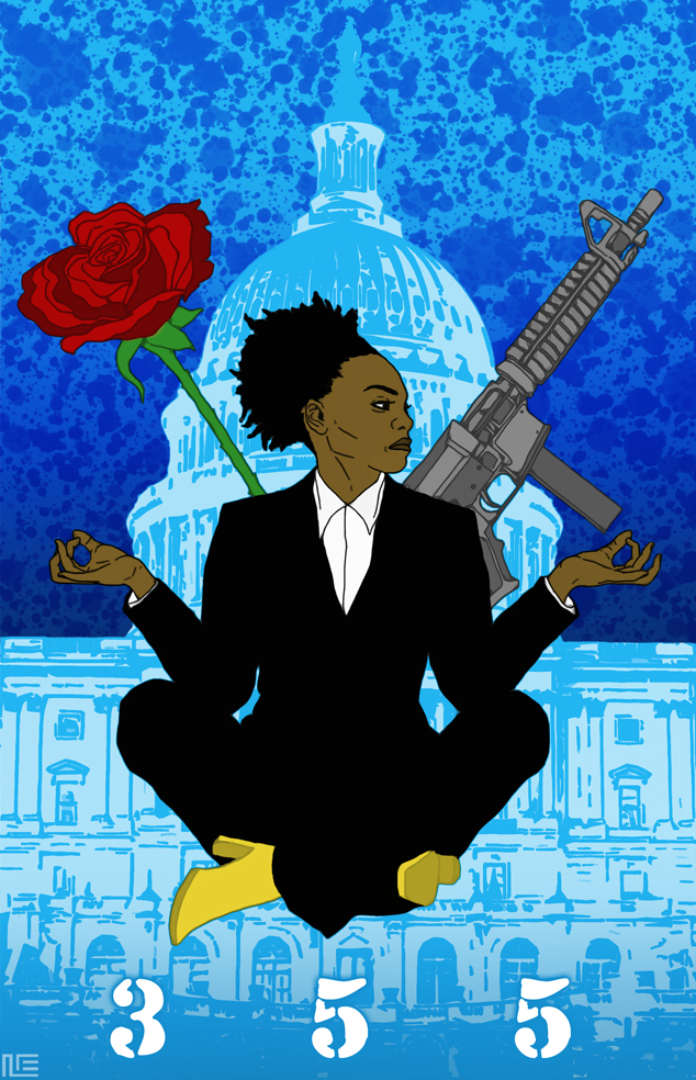
355


For some reason female characters seem to me more interesting than male ones. If there is a book with plenty of female characters that is Y The Last Man, and my favorite one there has always been Agent 355. When I thought of doing a 355 illustration I wanted to capture the dual essence of the character: the agressive side and the delicate one. Just as J. G. Jones' covers for the book, I also wanted to create a "Y" shaped composition here.
I think it's time to re-read Y The Last Man.
[Y The Last Man and Agent 355 created by Brian K. Vaughan and Pia Guerra]

Wednesday, September 30, 2009

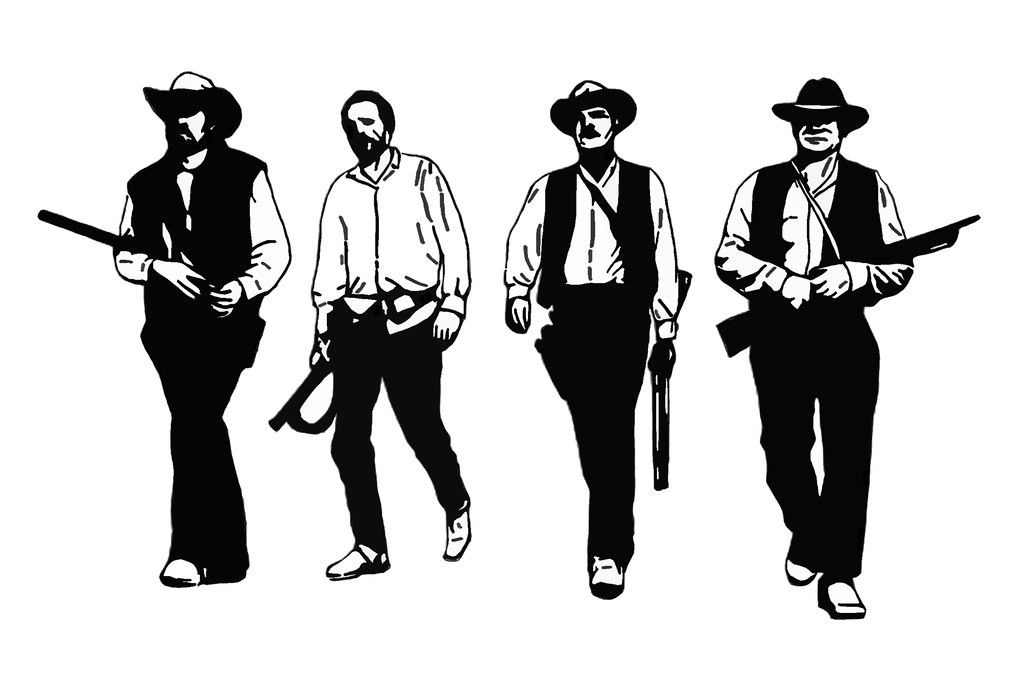
THE WILD BUNCH


This illustration began as a drawing for a tattoo a friend of mine wanted me to design for him. The tattoo was meant to show one of Sam Peckinpah's most famous frames from his film The Wild Bunch. But then the graphic designer inside me (ah, that little annoying bastard!) started messing with it, and that's the final result of it. I tried coloring this illustration, but I finally decided to keep it black-and-white to give it a more serious look.
[The Wild Bunch is a Warner Brothers film directed by Sam Peckinpah]

Friday, September 25, 2009

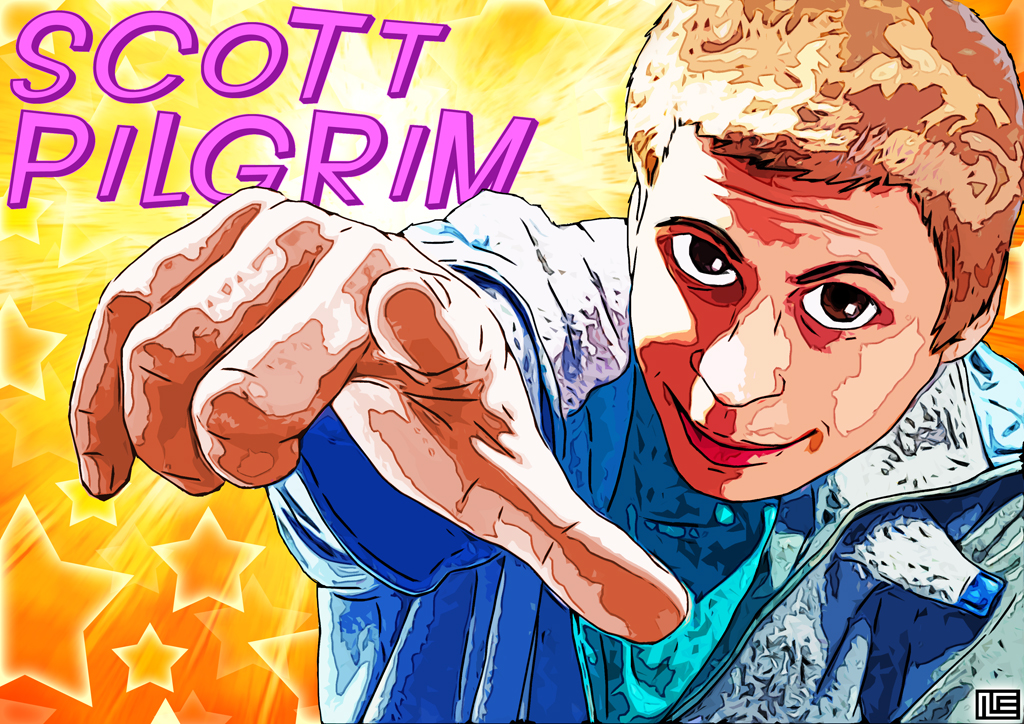
SCOTT PILGRIM


For this illustration I used photoreference, as I wanted Scott to look like Michael Cera (who's portraying the character in the upcoming Edgar Wright movie). Apart from that, the illustration is all digital. Even though it's a black-and-white book, I always imagine the Scott Pilgrim universe as a colorful place, and that's what I wanted to show here. The use of crazy elements in the image (like pink letters or shinning orange stars) contribute to create that surrealistically pop atmosphere too.
I've been a fan of Scott Pilgrim since I bought Volume 2 at Jim Hanley's Universe in 2004, during my first trip to New York City. I had read some reviews and had seen some preview pages from Volume 1, and although I didn't know who Brian Lee O'Malley was and didn't know anyone who was reading the book, I just got the feeling that I was going to like it.
[Scott Pilgrim created by Brian Lee O'Malley]

Monday, September 7, 2009

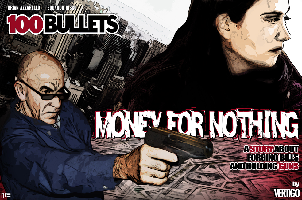
100 BULLETS - MONEY FOR NOTHING


This 100 Bullets illustration (kind of a fake cover, too) is a strange mix between photos and digital drawing. I liked the idea of composing the image the way you can either understand the girl is a potential victim of the gunman or his superior. When coloring it I decided to avoid using greens on the bills and turn them red, to have a more limited palette and also to symbolize the relation between money and crime (red is the color of blood).
My wife and my father were the models here.
[100 Bullets created by Brian Azzarello and Eduardo Risso. The Vertigo logo is a property of DC Comics]