Thursday, July 1, 2010

I PITY THE FOOL... BECAUSE I'M THE BEST IN WHAT I DO


Almost a month ago actor Donald Glover started a campaign to get the role of Peter Parker in an upcoming Spider-Man movie. There's been a lot of debate in the internet about whether having a black guy portraying Marvel's famous wallcrawler is a bad or a good idea, and even Stan Lee gave his two cents about it.
I myself have been a bit torn. I don't think it's necessary to have a black guy playing Peter Parker, as if the only way to create interesting black characters was to change white character's race. On the other hand, Spider-Man is a very well known character, and iconic characters end up beeing modified and versioned all along time. After all, if Shakespeare's plays have been set in WWII, in modern fictional Florida cities and even in the future, why can't Marvel have a black version of Spider-Man?
With that in mind, I decided to create a black version of one of Marvel's most famous characters. A lot of actors came to my mind, but none of them was more charismatic than Mr. T.
[Wolverine is a property of Marvel Comics]

Tuesday, June 29, 2010

TECHNO MUSIC


I've been feeling like creating a collage-style image since last month. Some days ago I was watching one of the videos I edited during my work at Sónar Festival when the idea popped up in my head. The final result is this colorful illustration where I tried to capture the variety of sounds, styles and textures techno music offers.

Monday, June 21, 2010

THE CROW


Some days ago I made this illustration for El Pique Del Mes blog, where every month a character or topic is chosen and different artists post their illustrations about it. This June the character was The Crow, and I decided to go with this cadaverous portrait. After all, The Crow is a guy who came back from the death.
[The Crow created by James O'Barr]

Monday, May 24, 2010

JASON AARON'S BEARD


Some months ago I made this all-digital illustration based on a picture of himself that writer Jason Aaron posted on his message board. Aaron liked the picture and has been using it as his profile picture in the Internet since the last two weeks (which honors me, of course).
The origin of this illustration was a thread about beards. When Aaron posted a picture of him, someone joked about the fact that he could be a character in Scalped (the awesome Vertigo book Aaron writes) and I tried to imagine how would Aaron look if he was indeed a character in his book.

Tuesday, May 18, 2010

NORTHLANDERS


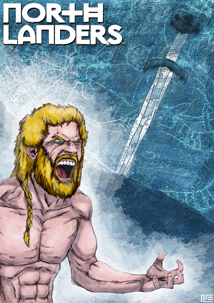
This illustration combines digital drawing and a mix of digital and watercolor painting for the background. I wanted to oppose the warm colors of the character (his skin, his hair) with a cold palette of blues in the background, symbolizing the wild temper of Norse warriors against the weather of those regions.
Brian Wood is a great writer, and that, combined with the fact that I love history books/comics, made me want to read NORTHLANDERS since the moment I knew this comic existed. I also love the idea that every story-arc is a different tale with different characters, moving from a time and place to another.
[Northlanders created by Brian Wood]

Tuesday, March 16, 2010

LINCOLN RED CROW


This illustration is a mix of hand-drawing and photoshop. I used pencil to render Red Crow's wrinkles to make them look more natural. One of my main problems was where to put the name of the character.
Lincoln Red Crow in one of the most complex and interesting characters in SCALPED, and I can easily say he has become my favorite one of the book.
[Lincoln Red Crow created by Jason Aaron and R.M. Guéra]

Friday, March 5, 2010

WOLVERINE


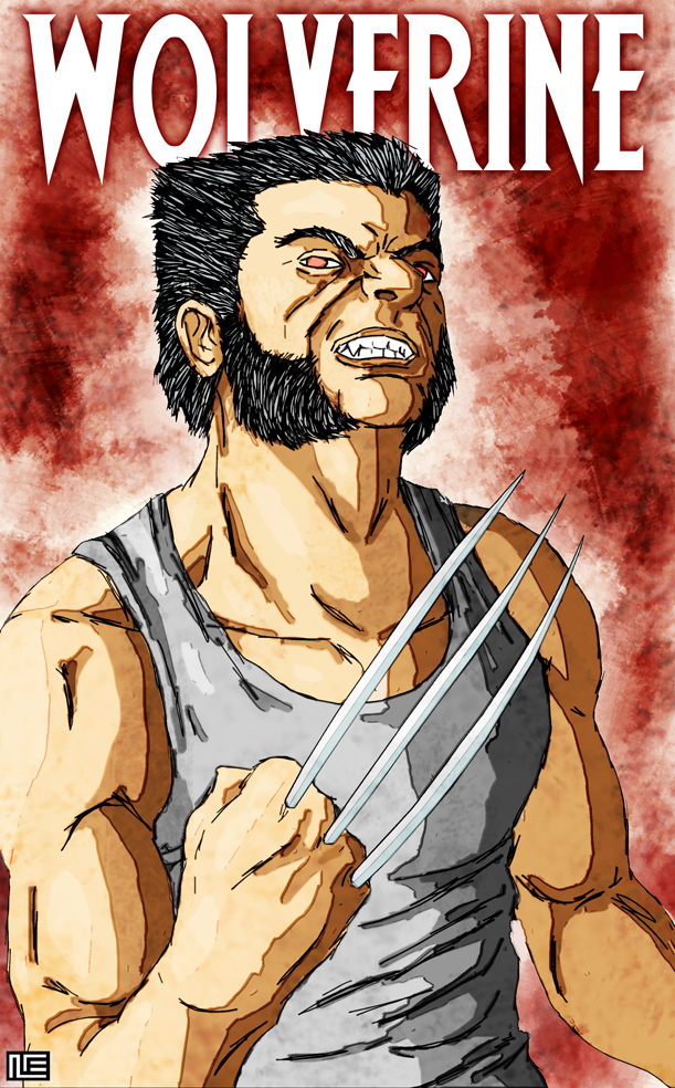
This is an all-digital illustration. My first idea was to keep Wolverine's drawing in black and white with a red background, but the character looked too lifeless to me and I ended up coloring it too. I also wanted to give the line of the drawing a rough, wild feeling, which is a style that I keep loving more and more.
Some months ago I showed this Wolverine illustration to a comic editor, who didn't quite like it because found it not to be very Wolverine-ish (oddly enough, it wasn't a Marvel editor). Sometimes I feel kind of tired of all those badass pin-ups where we always see him furious, and that's why I wanted to draw a hieratical Logan. Anyway, I guess that editor was right and that illustration (which I just realized I drew about a year ago) isn't the typical Wolverine we are all used to, so I decided to try a similar pin-up portraying an angrier Logan this time.
The model for this illustration was pal Juan Carlos Fernández.
[Wolverine is a property of Marvel Comics]

Thursday, January 28, 2010

THE GUY FROM HAWAII


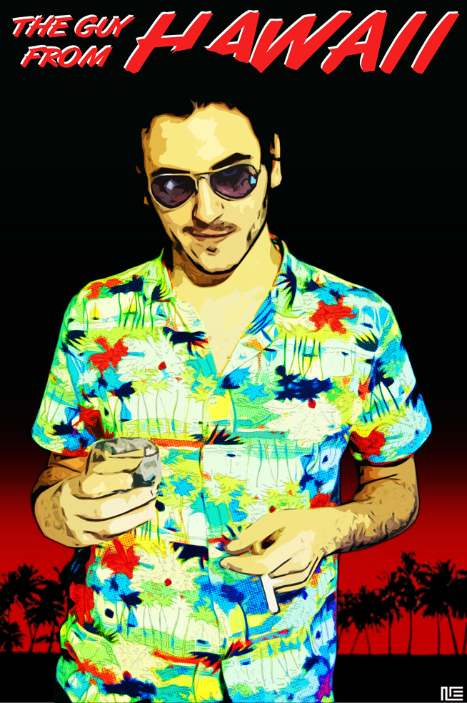
I mixed photography and digital drawing here. My challenge was to give the character a colorful touch (that the hawaiian shirt gave me) while keeping a noir feeling on the whole cover, and that's why I only used two colors (black a read are very noir colors for me) on the backgound.
For a long time now I've had in my mind that character who I used to call The Guy From Hawaii. Some days ago I filmed a short with actor Santi Gimeno-Bayón. Looking at how he was dressed, I realized that I had created a character for that short that was unintentionally inspired in The Guy From Hawaii character, so I decided to use him as the model for this illustration.

Saturday, January 16, 2010

CHOSEN


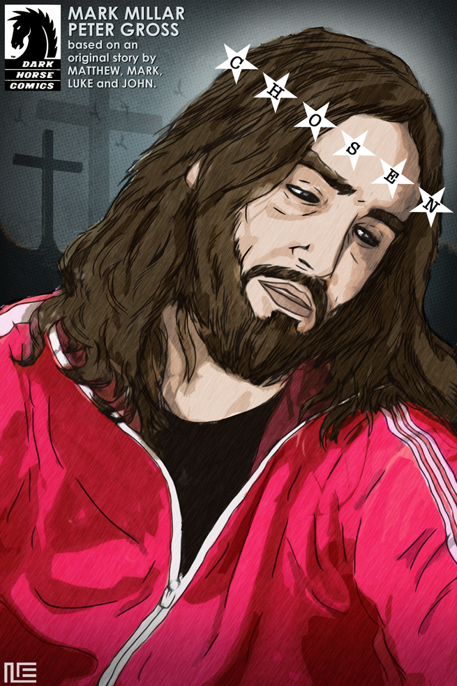
This is an all-digital illustration. I love the combination of Jesus' tilted head and sad expression (a typical Catholic depiction of the character) with the pink-red tracksuit. I wanted to incorporate the book's title in the whole image, and decided to use it as a metaphor for Jesus' crown of thorns.
I guess nobody can deny Jesus Christ is one of the most iconic figures in Western popular culture. That's why I find it kind of surprising that there are not many comics out there about the character.
I used a picture of pal Javi Gimeno as the basis for this illustration.
[Chosen created by Mark Millar and Peter Gross. The Dark Horse logo is a property of Dark Horse Comics]

Wednesday, December 30, 2009

THE WRITER


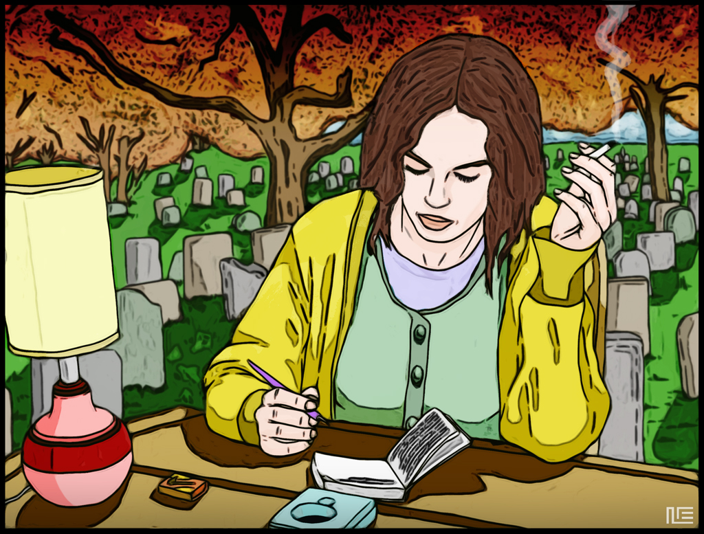
I had that idea for a very sad, melancholic illustration about a writer living in a house that was actually a cemetary. In my mind it was a dark, sinister, somehow Mignola-ish illustration that I really wanted to do... but I postponed it for a while, and when I took it up again some weeks later I found that I had changed my mine. Now I wanted to try how the same idea would look like if rendered with a bright and colorful style. I also decided to use flat colors to make it even naïver than the original idea. The result is, of course, something totally different from what it should have been, but I enjoyed a lot doing it.
The model for the writer was actress Mónica López, after some pictures of her I took during the filming of a music video she starred.